Catherien Pooler Designs
Website Design and
Branding and Marketing Refresh
professional work (2019 - 2023)
When I first started at Catherine Pooler Designs, an e-commerce-based paper crafting supply company, they were faced with the challenge of aging customer demographic. In order to reach a broader audience and appeal to the younger generation, they brought me on-board to provide a fresh perspective and refresh the brand’s visual identity without straying too far off from the original looks that their existing customers know and love.
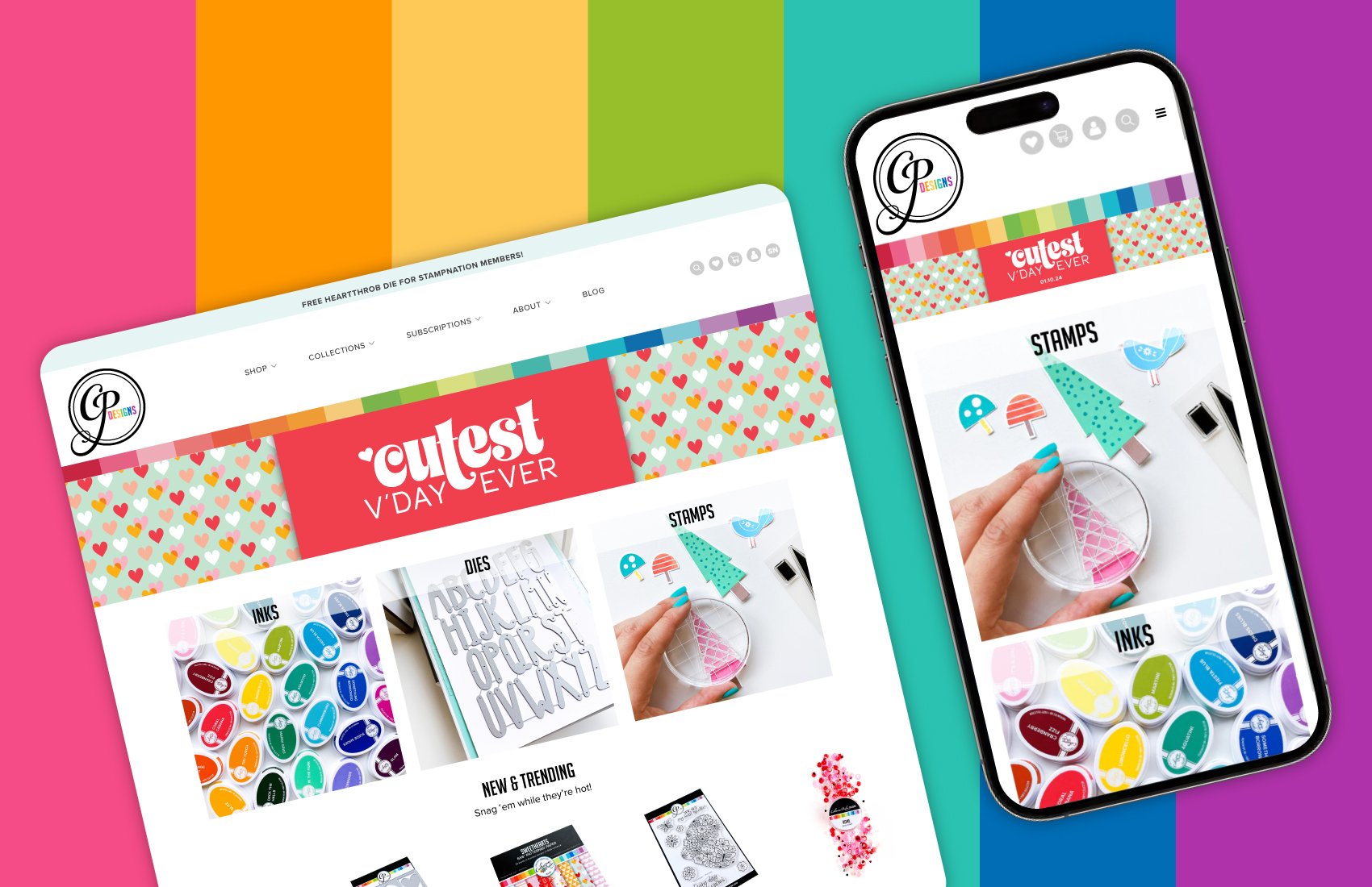
A few of the issues I found with the existing system were: 1) the original logo looked outdated and offered limited usage due to the small type and multi-colored floral images, 2) the main page of the website was on a WordPress blog, where the customers were then re-directed to the e-commerce site, and 3) the photography was dull and did not showcase the products well.
I redesigned the website, utilizing the company’s signature rainbow bar in the top header and refreshing the overall appearance to be cleaner and more modern. I also moved the home page to be hosted directly from the Shopify site, providing a more seamless browsing experience. The secondary text and the floral image on the logo was removed, and the colors were simplified, tying in the rainbow concept. The photography was also refreshed, using whiter backdrop and incorporating brighter pops of color.
ORIGINAL BRANDING
REFRESHED BRANDING
After assessing the company’s existing marketing, I concluded that they needed to build up their presence on Instagram. I took charge of the Instagram account–everything from taking pictures to writing captions and editing videos into reels. The company’s Instagram following grew from 18K to 40K within two years. The best performing reel has 2.3M views on it.


